The Difference Between Linear And Log Displays In Flow Cytometry

Data display is fundamental to flow cytometry and strongly influences the way that we interpret the underlying information.
One of the most important aspects of graphing flow cytometry data is the scale type. Flow cytometry data scales come in two flavors, linear and logarithmic (log), which dictate how data is organized on plots. Understanding these two scales is critical for data interpretation.
Let’s start at the beginning, where signal is generated, and trace its path all the way from the detector to the display.
Behind every flow cytometry data point is what we call a pulse. The pulse is the signal output of a detector generated as a particle transits the laser beam over time. As the cell passes through the laser beam, the intensity of the signal from the detector increases, reaches a maximum, and finally returns to baseline as the cell departs the laser beam. The entirety of this signal event is the pulse (see Figure 1).

Figure 1: The voltage pulse begins when a cell enters the laser, hits its maximum when the cell is maximally illuminated, then returns to baseline as the cell exits the beam.
This is all good, but an electrical pulse is not useful to us in and of itself. We need to extract some kind of information from it in order to measure the biological characteristics we are seeking. This is where the cytometer’s electronics (which contribute significantly to a particular cytometer model’s performance heft and price tag) come into play.
Modern instruments employ digital electronics. This means that the signal intensity over the course of a pulse is digitized by an analog-to-digital converter (ADC) before information is extracted from it.
This was not the case in the past, when most systems used analog electronics. In analog systems, the information about a pulse is calculated within the circuitry itself, and is digitized for the sole purpose of sending the data to the computer for display.
Regardless of the instrument, the type of data provided about the pulse is the same: area, height, and width (see Figure 2). These three pulse parameters are what are ultimately displayed on plots.

Figure 2: Three characteristics of the voltage pulse: area, height, and width.
Area and height are used as measurements of signal intensity, while width is often used to distinguish a single cell from two cells that passed through the laser so close together, that the cytometer classified them as one event (a doublet event).
Typically, on flow cytometry plots, you will see the axis or scale labeled with an A, H, or W denoting the pulse parameter being displayed (e.g. “FITC-A,” “FITC-H,” or “FITC-W”).
It is important to note that all of the pulse processing is performed in the cytometer electronics system, not in the computer.
The reason for this is that the required speed for processing can exceed what is possible with the computer and its ethernet connection. Given this, the cytometer passes all of the pulse measurements, already neatly processed and packaged, to the computer and cytometer software that graphs the data.
This is when plot scaling becomes important.
The range of signal levels that the cytometer transmits to the computer is extremely large, and is a function of the cytometer’s ADC. The number of bits of the ADC determines how many values comprise this range of signals.
For example, a 24-bit ADC can divide the range of signals into 16,777,216 (224) discrete values. (Note that each scatter or fluorescence channel gets its own ADC, so the number of ADCs equals the total number of parameters on the instrument.) Therefore, the dimmest FITC signal on this example instrument can be assigned a value of 1 while the brightest FITC signal can be assigned a value of 16,277,216.
Even though the granularity of each signal is assigned 224 different values, this kind of resolution is much too fine to be useful on the scales of plots.
If a histogram’s scale reflected this many values, events would be spread out among so many channels that we would need to collect millions of events to see the peaks and populations we are used to.
Furthermore, computer monitors don’t have the resolution required to draw dots on this scale. Even if they did, the dots would be so small we wouldn’t be able to see them on the screen.
The universally employed solution is to scale down the resolution on plots to a more practical, but still useful, degree.
Instead of dividing the scale into millions of units, we divide it into 256 (or, in some cases, 512) units called channels.
For a 256-channel system, we allocate all 16,277,216 digital values equally among the channels, so that each one contains 65,536 discrete values (16,277,216 divided by 256). Channel 1 can contain up to the dimmest 65,536 events, while channel 256 can contain up to the brightest 65,536 events.
This kind of scale is linear because equivalent steps in spatial distance on the scale represent linear changes in the data. As illustrated in Figure 3, moving a distance of x reflects a change of 64 channels, regardless of whether the starting point is channel 0, channel 64, or channel 192.
As such, the key feature of a linear scale is that the channels are distributed equally along the scale: the distance between channel 1 and channel 2 is the same as the distance between channel 100 and channel 101.
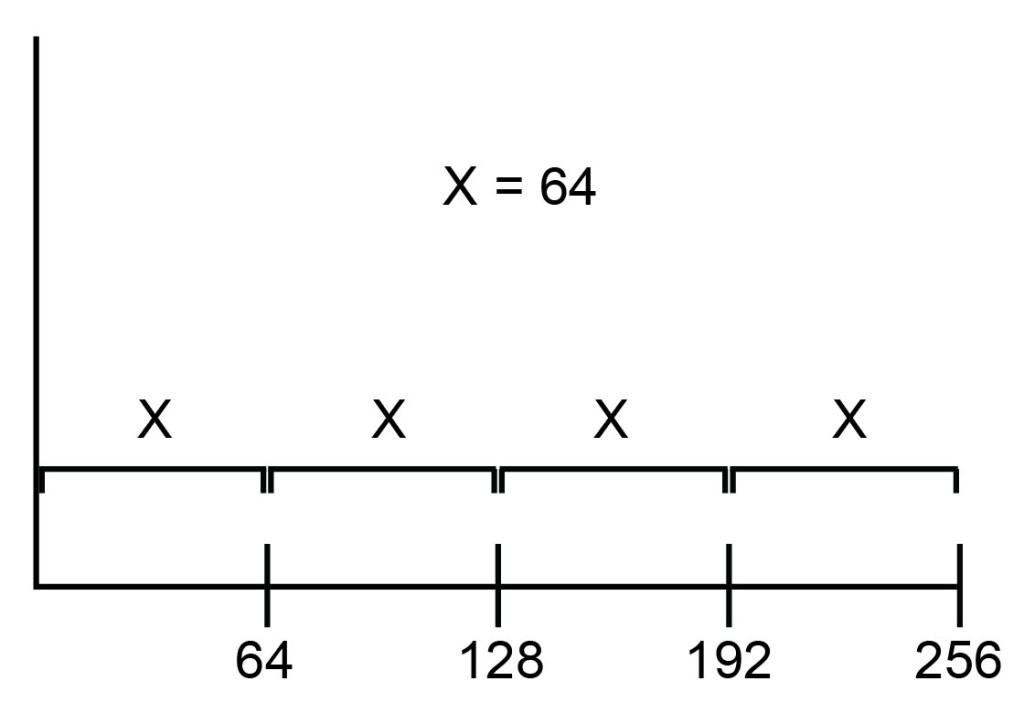
Figure 3: On a linear scale, channels are spaced equally.
Linear scale is certainly nice, but what happens if two populations, with very different levels of intensity, must be plotted together? This is a common situation in flow cytometry, in which nonfluorescent cells are visualized on the same plot as brightly fluorescent cells.
In this case, a plot with linear scaling becomes much less useful, as it will be very difficult to see both fluorescent and nonfluorescent cells at the same time, no matter what PMT voltage we use. Either all the nonfluorescent cells will be crammed into the first few channels, or all the fluorescent cells will be crammed into the top few channels.
This is where a logarithmic scale comes into play.
A log scale is one in which steps in spatial distance on the scale represent changes in powers of 10 (usually) in the data.
In other words, moving up a log scale by one quarter of the scale allows us to move from channel 1 to channel 10 (see Figure 4). Moving another quarter distance up the scale brings us not to channel 20 but to channel 100, a power of 10.

Figure 4: On a log scale, channels are unequally spaced so that one can visualize both high and low signals on the same plot.
Log scales are really good at facilitating visualization of data with very different medians, and are organized into decades. A four-decade log scale is marked: 101, 102, 103, 104, so it contains 10,000 channels in total.
Importantly, even though each channel itself contains the same number of digital values, data channels are not distributed equivalently across the scale.
The first decade, from 100 to 101, contains 10 channels (channel 1 to channel 10). The second decade, even though it occupies the same amount of space on the scale, contains not 10 but 90 channels (11 to 100). And, the fourth decade from 103 to 104 — occupying the same space as each other decade does — contains a whopping 9,000 channels (1001 to 10,000).
On the log scale, data is compressed to a much greater degree at the high end than it is at the low end, and it is this very property that makes it so good for visually representing data with very different medians (see Figure 5).
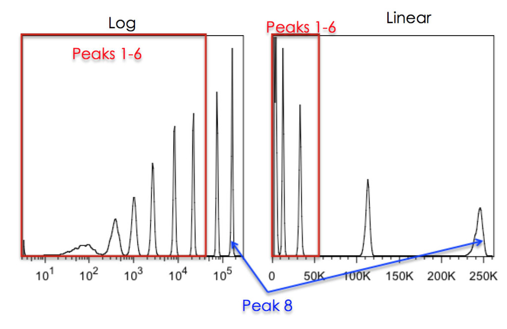
Figure 5: Effects of Linear vs Log scaling on resolution of 8-peak beads. The Spherotech 8-peak bead-set was run on a DIVA instrument with either Log scaling (left) or Linear scaling (right). The 8th peak was placed, on scale, at the far right of the plot. As can be seen, without log scaling of the data, the bottom 6 peaks cannot be resolved.
It is very important to keep in mind that in the digital cytometry world, these scales are solely visualization methods and, like a compensation matrix, have no effect on the underlying data. The scales are applied by the cytometry software, not the cytometry hardware.
Incidentally, this was not the case in older analog systems which applied the logarithmic transformation in the cytometer electronics using logarithmic amplifiers, so the data streamed to the computer was already “log transformed” before it got to the software.
At this point, you are probably wondering about the practicalities of these scales: when should you use linear scale and when should you use log scale?
Typically, linear scale is used for light scatter measurements (where particles differ subtly in signal intensity) and log scale is used for fluorescence (where particles differ quite starkly in signal).
However, it is not always this simple.
For most flow cytometry on mammalian cells, the range of both forward and side scatter signals generated by all particles in a single sample is not wide enough to warrant a log scale for proper visualization.
Particle size may range from a few microns to 20+ microns in a typical sample, so the entire gamut of particles would be happily on-scale using a linear scale. In fact, log scale would be counterproductive in this situation, compressing the range and making it difficult to differentiate different blood cell populations from each other, for example.
However, side scatter on a log scale can be extremely informative, especially when measuring “messy” samples with many different kinds of cell types, like those generated from dissociated solid tissues.
Additionally, make sure to use both forward and side scatter on log scale when measuring microparticles or microbiological samples like bacteria. These types of particles generate dim scatter signals that are close to the cytometer’s noise, so it’s often necessary to visualize signal on a log scale in order to separate the signal from scatter noise.
Fluorescence measurements typically involve populations that differ significantly in intensity, and thus require a log scale for visualization. This is the case when measuring signal from immunofluorescence, fluorescent proteins, viability dyes, or most functional dyes.
However, there is a major exception: cell cycle analysis. Cell cycle analysis by flow cytometry is usually accomplished by measuring DNA content via fluorescence. Cells in G2/M contain up to twice the amount of DNA found in other cells, so we need to see relatively small differences in signal intensity in order to assess cell cycle state.
Therefore, cell cycle analysis must be visualized on linear scale.
We hope this explanation sheds some light on scaling. Knowing how to properly display your data is a critical part of scientific communication. Remember to use linear scaling for most scatter parameters, or when you need to visualize small changes, and log scaling for most fluorescence parameters, or when you need to visualize a wide range of values. As always in flow cytometry, there are certainly exceptions, but armed with this knowledge, you should be able to make educated judgements about which scale types to use in various assays and to better interpret your data. Happy flowing!
To learn more about The Difference Between Linear And Log Displays In Flow Cytometry, and to get access to all of our advanced materials including 20 training videos, presentations, workbooks, and private group membership, get on the Flow Cytometry Mastery Class wait list.

ABOUT TIM BUSHNELL, PHD
Tim Bushnell holds a PhD in Biology from the Rensselaer Polytechnic Institute. He is a co-founder of—and didactic mind behind—ExCyte, the world’s leading flow cytometry training company, which organization boasts a veritable library of in-the-lab resources on sequencing, microscopy, and related topics in the life sciences.
More Written by Tim Bushnell, PhD


